Project Gemini
An IBM team's moon mission to reinvent the user experience of its two biggest products.
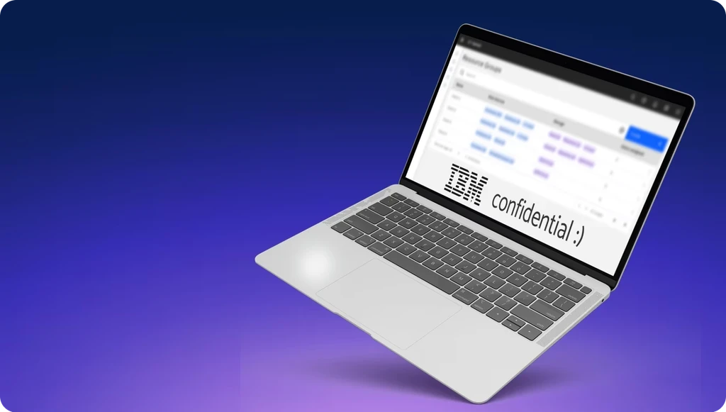
⚠️ This project contains NDA-sensitive information, and some information has been redacted or modified to comply. This does not affect the process, story, or outcomes. Thanks for understanding!
Overview
Built by two separate groups at different times, this IBM team had inadvertently created an experience where users would have to jump between two interfaces to monitor and perform the same operations on different parts of a system. Over 4 months, we combined past research with feedback from 4 week-long design sprints to create a prototyped vision of what these worlds would look like, combined.
My role
Plan and participate in 4 design sprints
Coordinate and facilitate research sessions for each sprint
Share feedback and maintain alignment with stakeholders
Rapid prototyping
Workshop facilitation
User interviews
Wireframes
Sketching
Storyboard
"Please just give me one tool to [do the thing]."
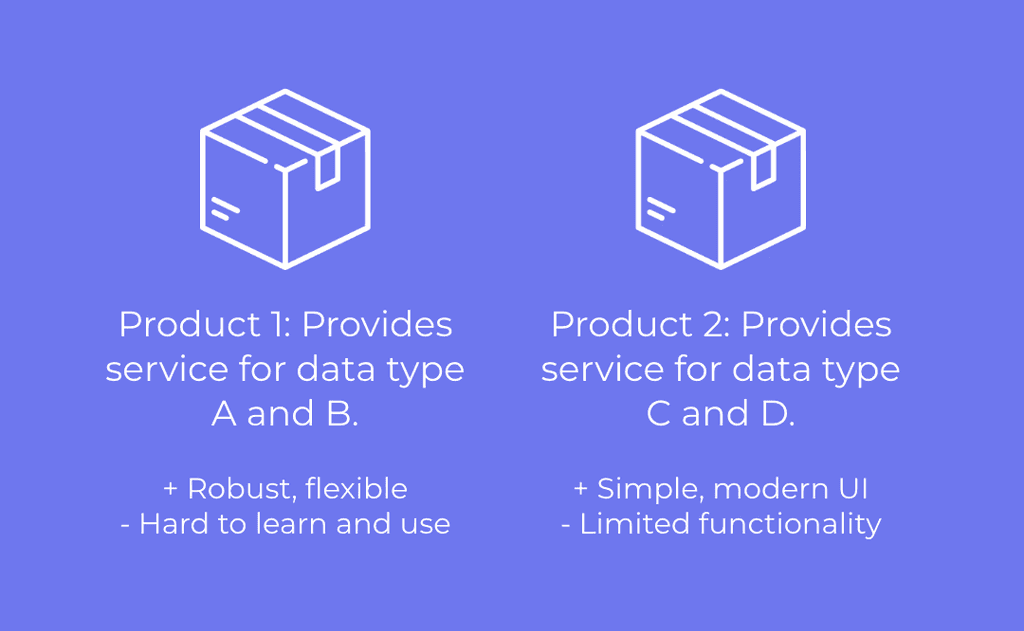
In essence, these two software did almost the same thing, but for slightly different situations. Users who encountered both situations would need to buy both software and hop between the two, which was a big turn off.
The current experience was often described by users as "far behind", "tolerable", and even "a nightmare". The challenge was simple, and intimidating: Create a prototyping that captured the main functionality of both products in 6 months.
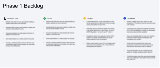
Prioritizing goals democratically
In order to narrow down what would be the most beneficial for the users and the business, we ran a workshop where we leveraged past research to brainstorm high-level goals that our 2 main personas would have for using the product. We ended up with 14 potential goals that we could design for in this project.
Rather than shoving everyone in a room to debate which goal was best, we opted to send out a survey asking stakeholders (PMs, Engineering leads, and Design managers) to "rate" each goal with a pennies-in-a-jar exercise. By asking people to quantify their rating for each, we could get the prioritization we needed quickly to accommodate the quick time frame.
In the graph below, you can see goals #7 and #12 had the highest sums by far. But, #1 also caught our interest because it had the highest collective confidence (many people invested at least some of their fictional money into that one). So we marked it as a stretch goal.
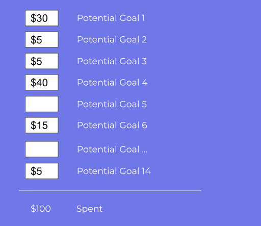
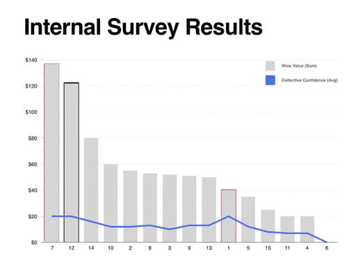
Survey results
4 design sprints = a marathon?
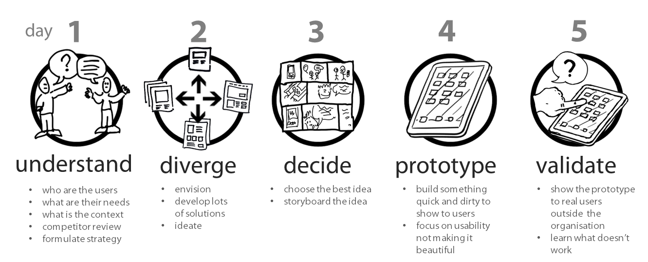
We adapted GV's Design Sprint to include many more touchpoints with stakeholders, and planned 3 design sprints. Here's a synopsis of what went down:
Sprint 1: We consolidated tools related to access & security. We worked closely with engineering and read documentation to verify the technical accuracy of the design. When testing with users, they informed us about a necessary external tool that many use to manage role-based access.
Takeaway: “If it’s not integrated with [that tool], we won’t use it!”
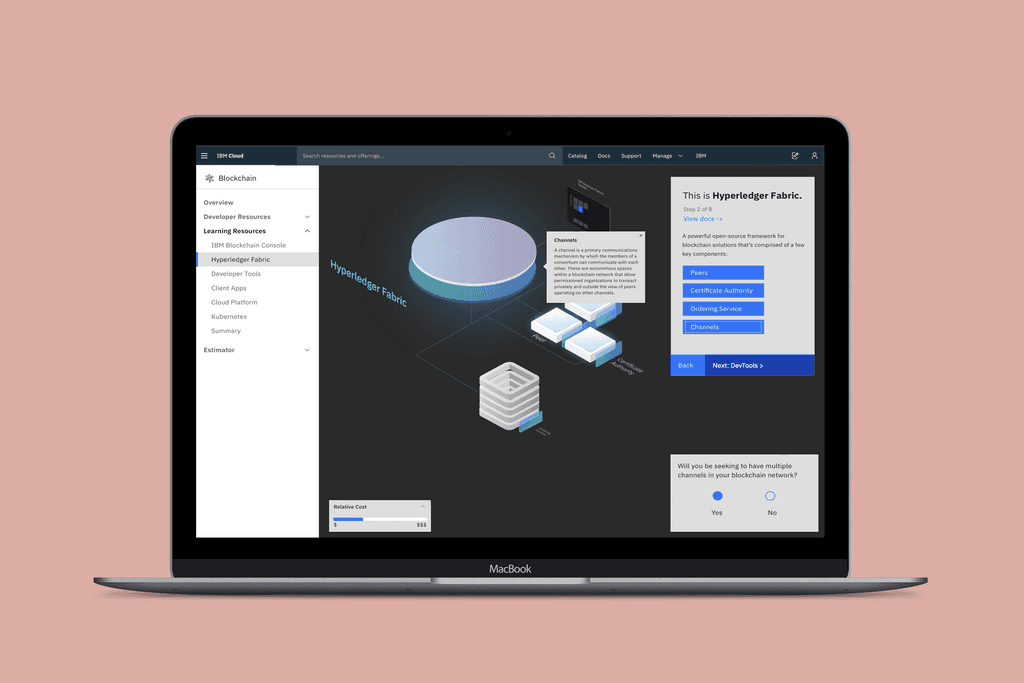
Sprint 2: This phase was about rethinking the object model used between the products - one robust and complicated, one simple and inflexible.
The idea we came up with was pretty low-fidelity, novel, and abstract, but that’s what starting points are for! Users and stakeholders liked the direction we were heading, but worried that in trying to make things simpler, we may have made them more complex by introducing new concepts. How can we retain more of what users are familiar with? I would have loved to explore that question, but it was time to move on!
Takeaway: We should increase the learnability of our new object model by leveraging more concepts that users are already familiar with.
Sprint 3:
This phase focused on consolidating what we have so far and ensuring the new design patterns we introduced were consistent. In the end, we succeeded in progressive disclosure and usability in the UI. However, there were still many questions around our new ideas and wariness about using complex jargon to describe industry-standard concepts.
Takeaway: With the groundwork for most of the UI patterns done, we could focus next on refining the object model.
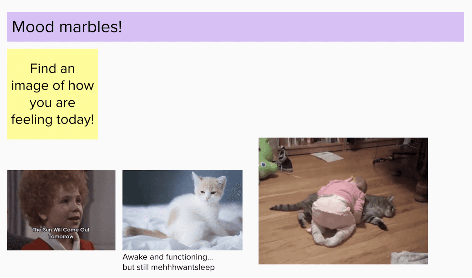
This image sums up how the team was feeling after 3 back-to-back sprints…
Positive results so far!
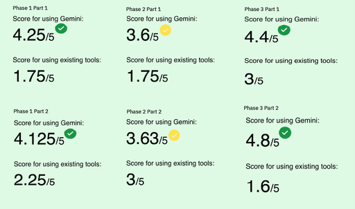
As a built-in part of the design sprint, we test our concepts with users after the week's intensive. Ratings for our concepts were consistently higher than doing the same tasks with the existing tools.
Ratings were based on a modified Kano model with 5-8 users each. The yellow check mark indicates that the difference between as-is and to-be is less significant for this phase 2, so when revisiting we should take extra care to challenge our assumptions.
But, it was becoming clear that any new ideas would remain too abstract to properly evaluate without properly defining what backend changes were possible. We needed to get answers from development. And to be honest, if I had a time machine I would have done this before we started the design sprints. In any case, we planned workshops with developers to solidify the technical constraints when…
What comes next
...a change in leadership turned our roadmap on its head. Backend changes were suddenly prioritized before usability and IA changes, and as these features would likely take several quarters to complete, we wrapped up our work with a bow for the designers who would pick up this work in the future.
Although the next phase of the project was postponed, we now have designs for the major workspaces in a consolidated product, and a list of new ideas and feedback from users. I'm looking forward to telling you more when the project completes!
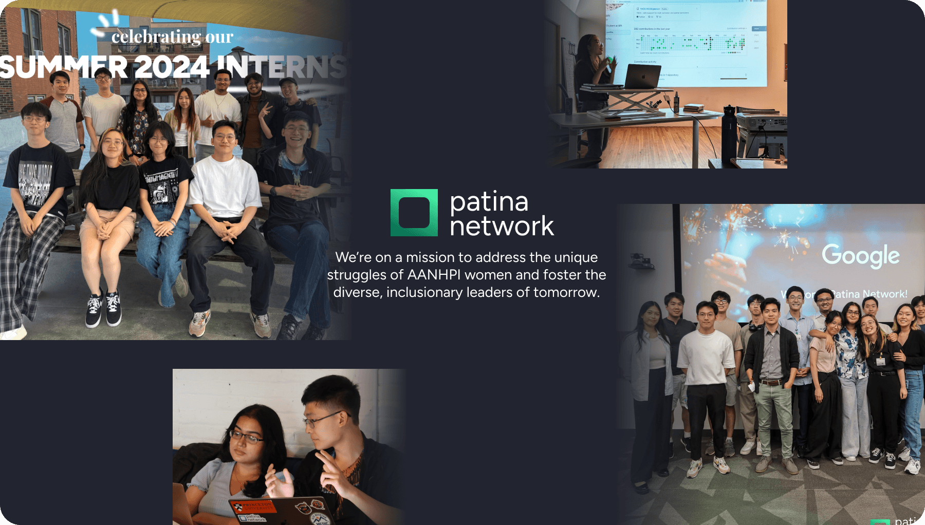
Patina Network: Leadership, Workshops, and Strategy
How I led a series of workshops that transformed the vague ideas into an actionable roadmap, already benefitting dozens of students in just 4 months.
Service Design
Visual Design
Management
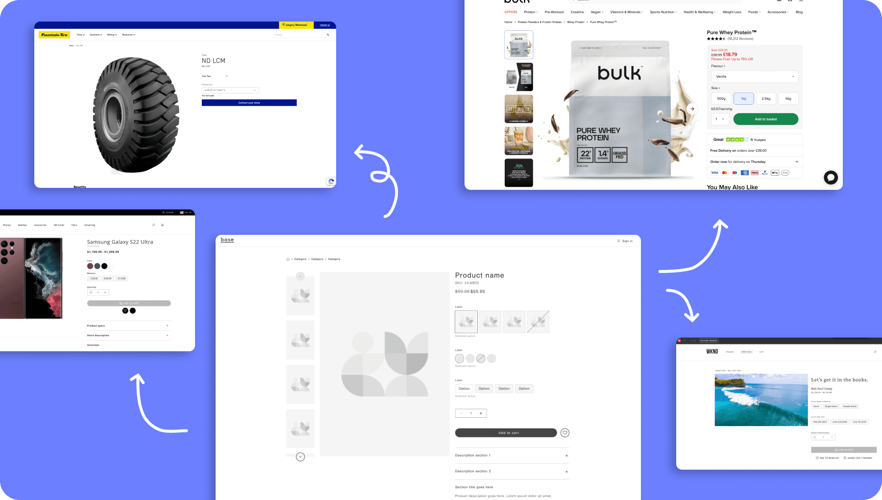
Adobe Commerce Storefront
Adobe's new e-commerce storefront framework designed obsessively with modularity and customizability.
UX Design
Design Systems
Scalability

Design is a conversation. Let's have one!
celinathedesigner@gmail.com